FEELS
BRANDING SYSTEM
CREATIVE DIRECTION
Although digitally connected, Gen Z is disconnected and looking for better and deeper ways to communicate and connect with each other. Feels is a new communications app that lets you express a feeling, state of being or speak a new language via music video clips, with the option to design the song lyrics as well. Technically this app is designed for the TikTok generation… but that ain’t me and you will definitely catch me using it once it launches.
BRAND IDEA
Music is the language everyone speaks.
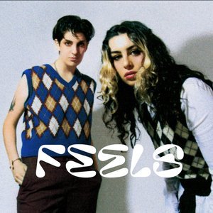
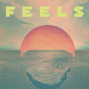
BRANDING, LOGO DESIGN & COLOR PALETTE
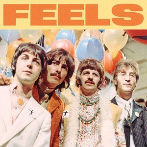
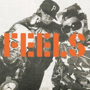
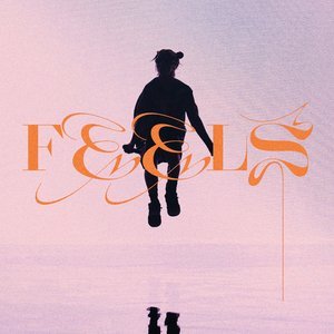
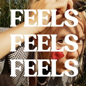
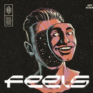
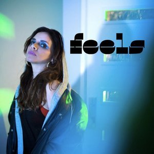
The Feels logotype is inspired by the movement and reverberation of music. It’s got a kinetic, electric, “always on” look. It also speaks to the RGB color space common to video. It communicates that Feels is for sharing and expressing yourself via music video clips.
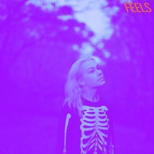
The color palette is intended to create an instant, instinctual, lasting, emotional connection. The palette is inspired by the RGB color system, used for video communication to represent the diverse music and visual culture of Feels.
The gradient scale is for limited use, including to emphasis actionable items within the app. It also gives Feels permission to use any color for album covers

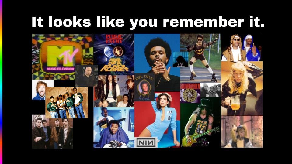
OUR BIG IDEA for the branding is we want to own ALL THE FEELS in the advertising space.
FEELS can own all the colors, all the fonts and all the feels. Because that is how you know Music artwork.

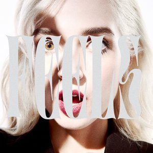
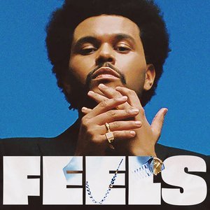
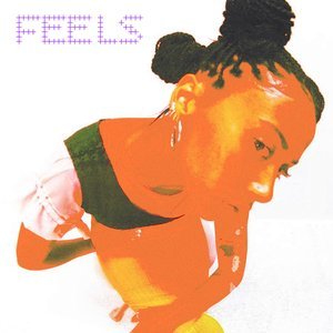
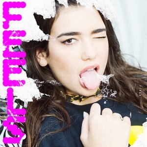
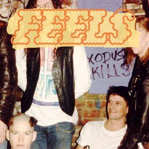
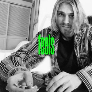
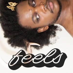
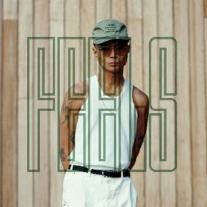

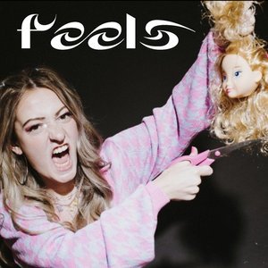
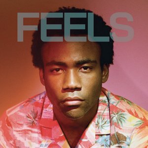

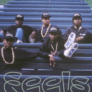
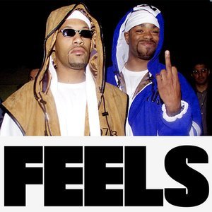
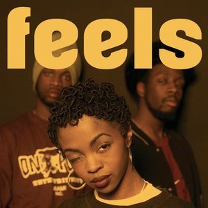
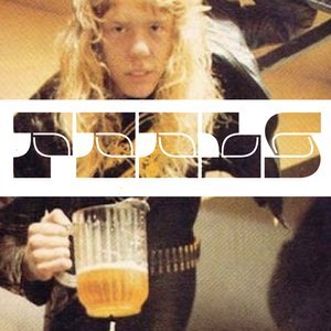
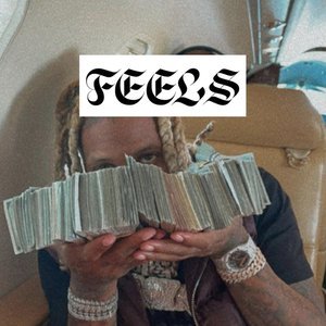
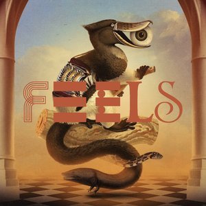
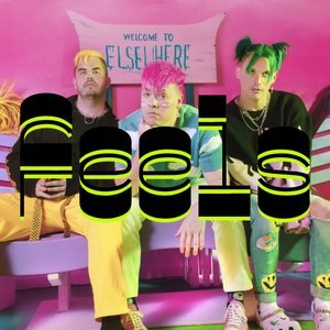
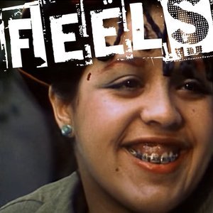

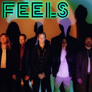
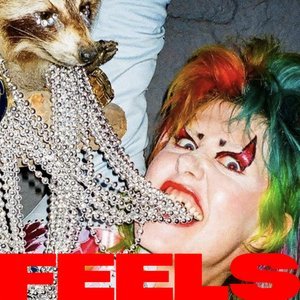
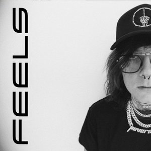
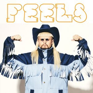
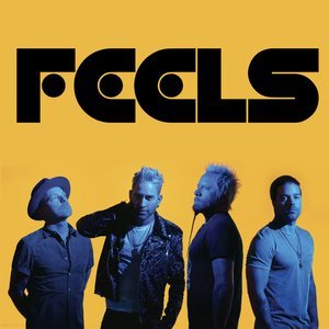
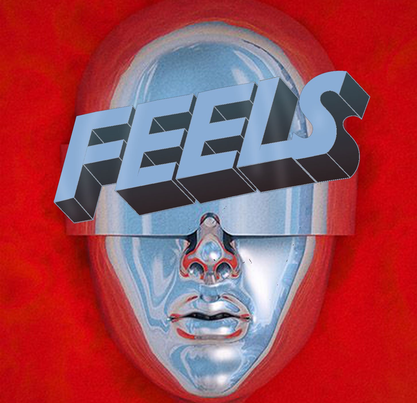
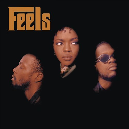
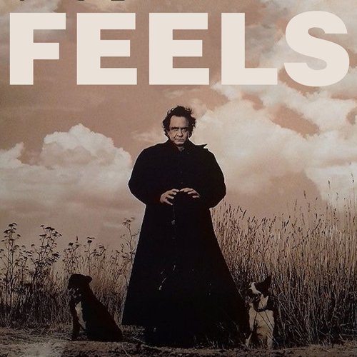
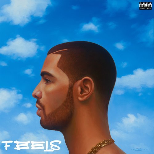
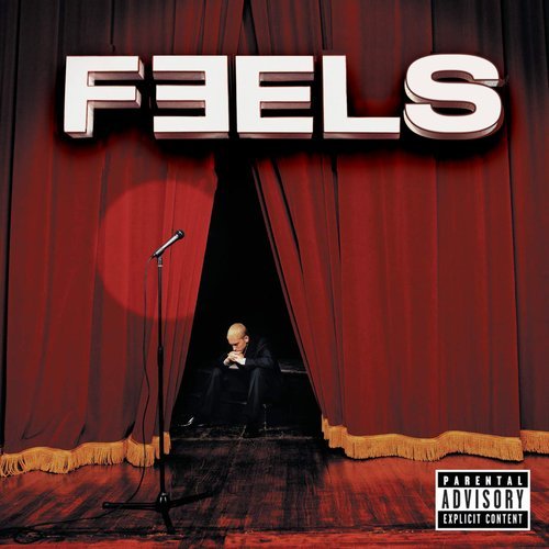
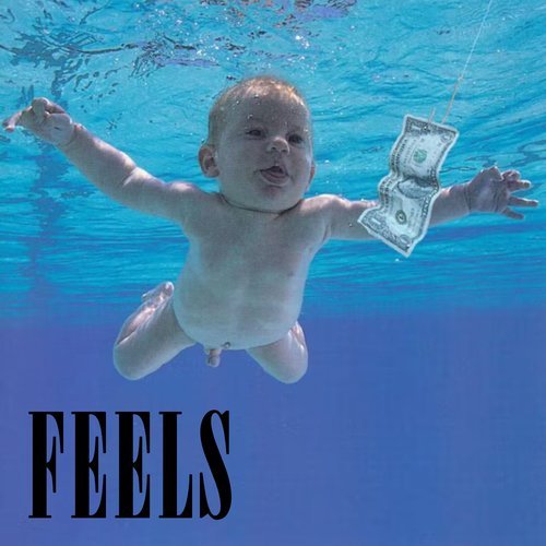
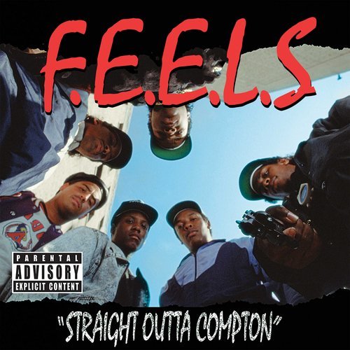
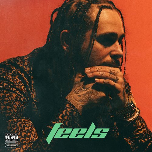
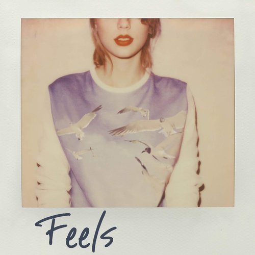
To own music video culture, we have to show that we ARE music video culture. Decades of album art, artist photos and iconic fonts are an endless bank of visuals to create ads with. Building OOH and display campaigns with these elements instantly connects Feels with music, self-expression, and positive emotions.


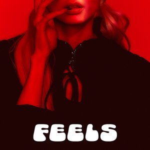
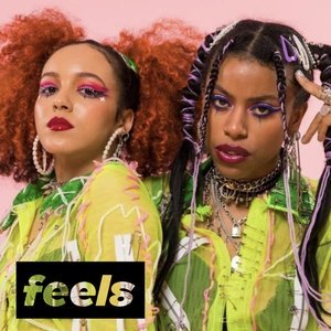
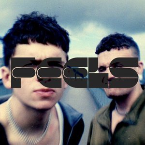
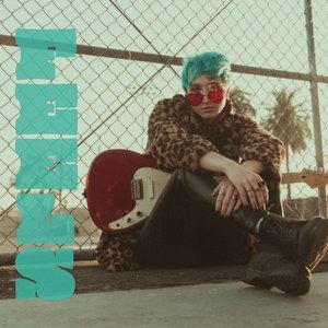
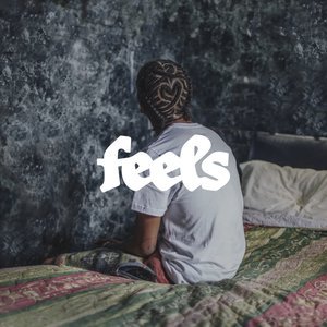
SOCIAL
Owning all the feels on social means sharing memorable, thumb-stopping visuals that look as iconic as the albums that inspired Feels. Feels makes a uniquely powerful connection between itself, music, and expression right where we live.

