Kaiser Permanente
SOCIAL BRANDING FOR KP
CREATIVE DIRECTION

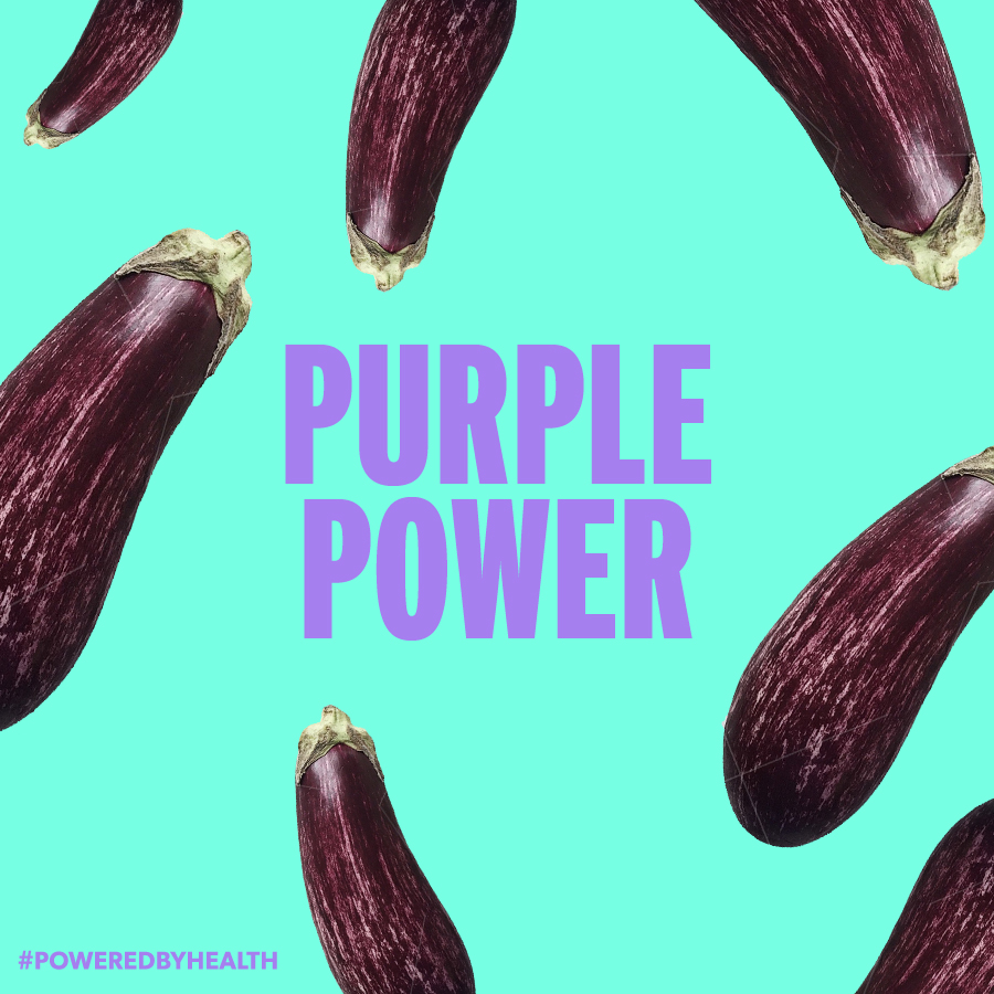
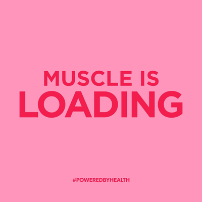
#PoweredByHealth
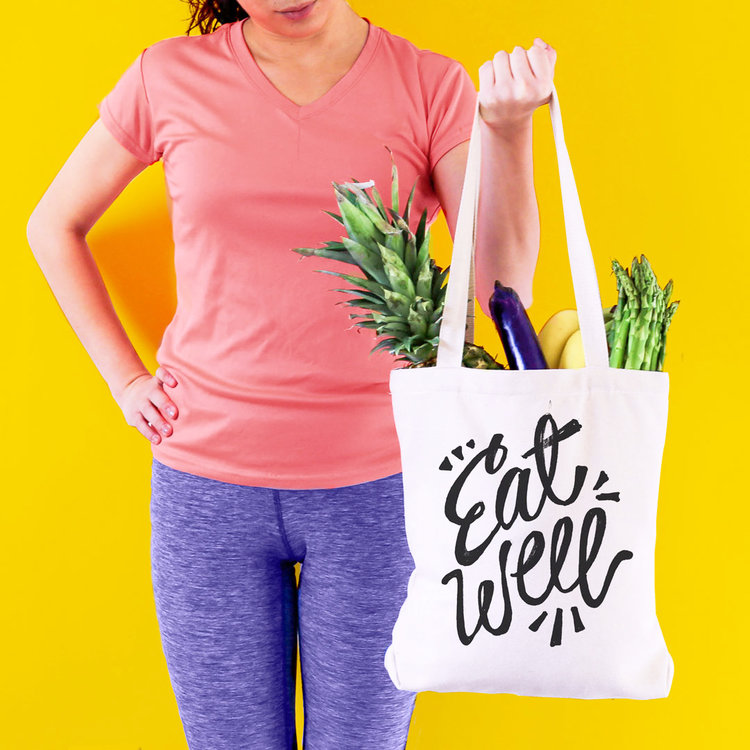
We helped Kaiser Permanente reposition itself as the predominant voice of healthcare for millennials. We targeted our largely female audience by creating a social media muse, "Zoe": our restless, confident, and conscious consumer looking for long-term changes in her lifestyle. We were tasked to create a vibrant, approachable, and wellness-centered channel that resonated with all the "Zoe's" of the world.
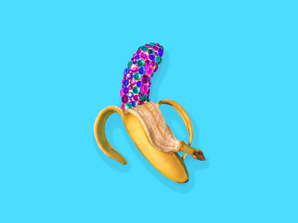
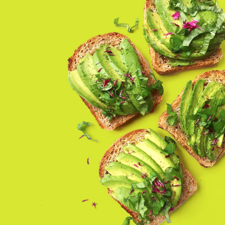
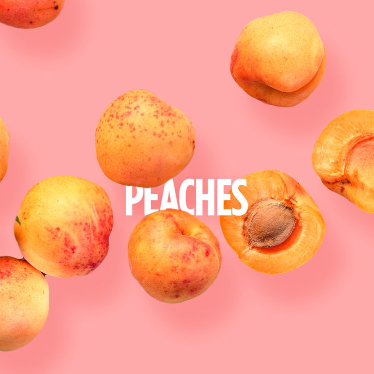
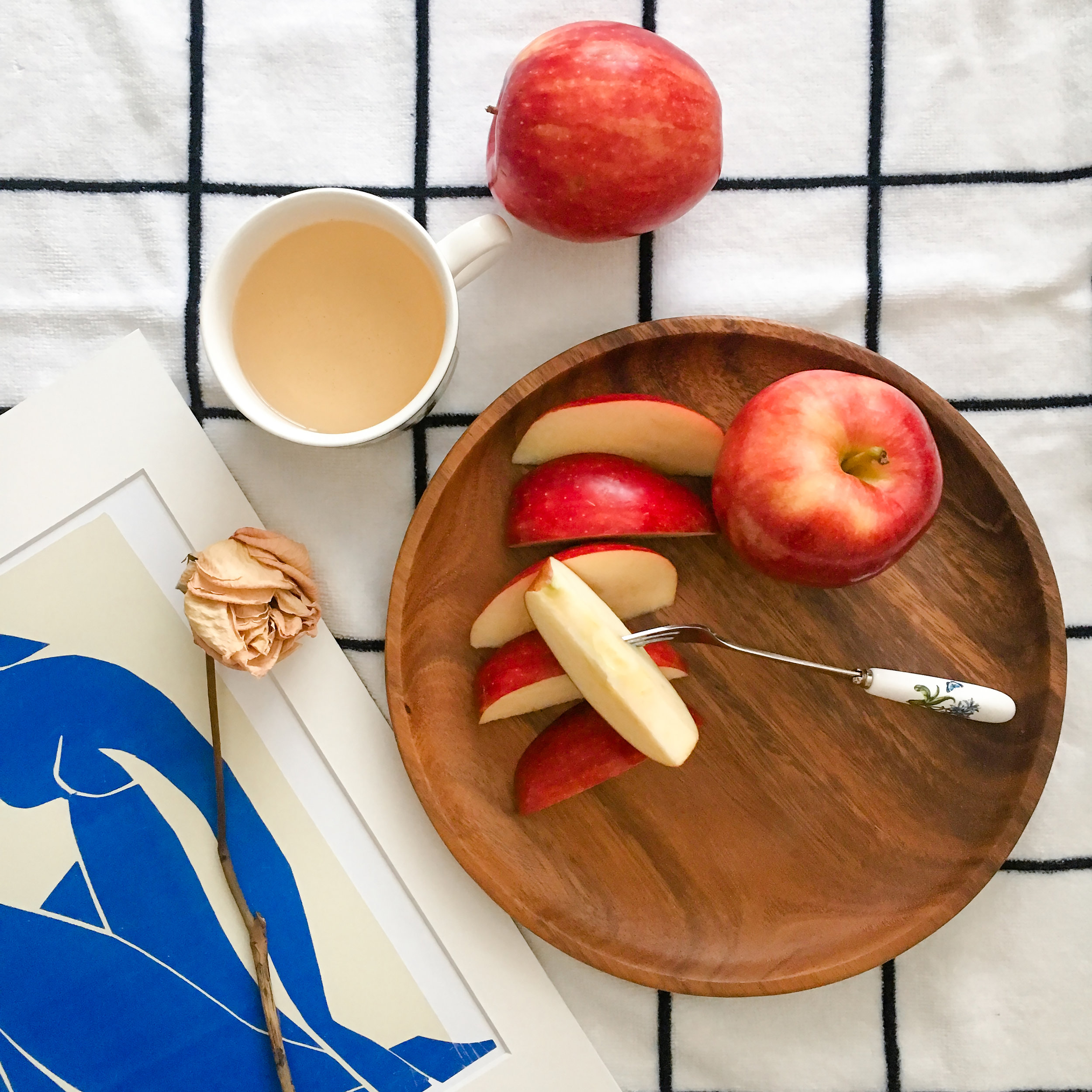
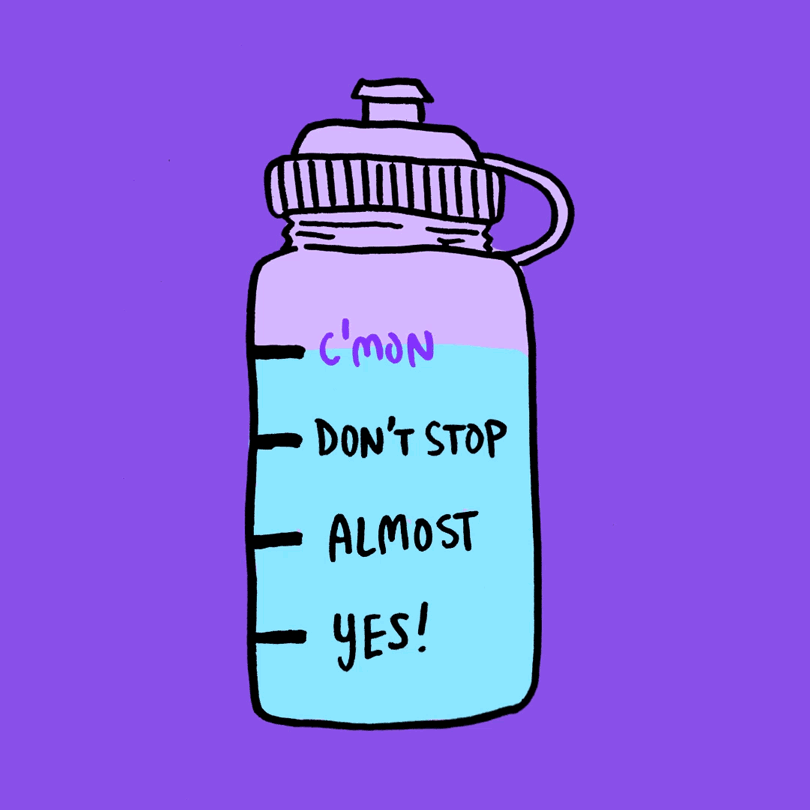
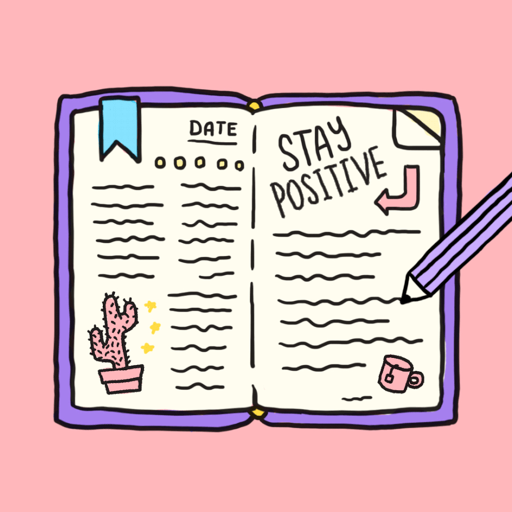
We achieve this vibrant and young feeling by changing KP's visual language. We chose lighthearted, colorful imagery with just a hint of cheekiness. We also use a mixture of straightforward dialogue and handwritten typography to emphasize the brand's personality and individuality. The compilation of new color, language, and illustration creates a bright and personable social presence while always referring to content that is #poweredbyhealth.


Color & Type
The KP world is positive, vibrant, and inspiring. We use these colors for eye-catching visuals to inform our illustrations, typography, and photography. The identity typeface, Gotham, is used for testimonials and large amounts of copy done in a direct and approachable way.

Illustration
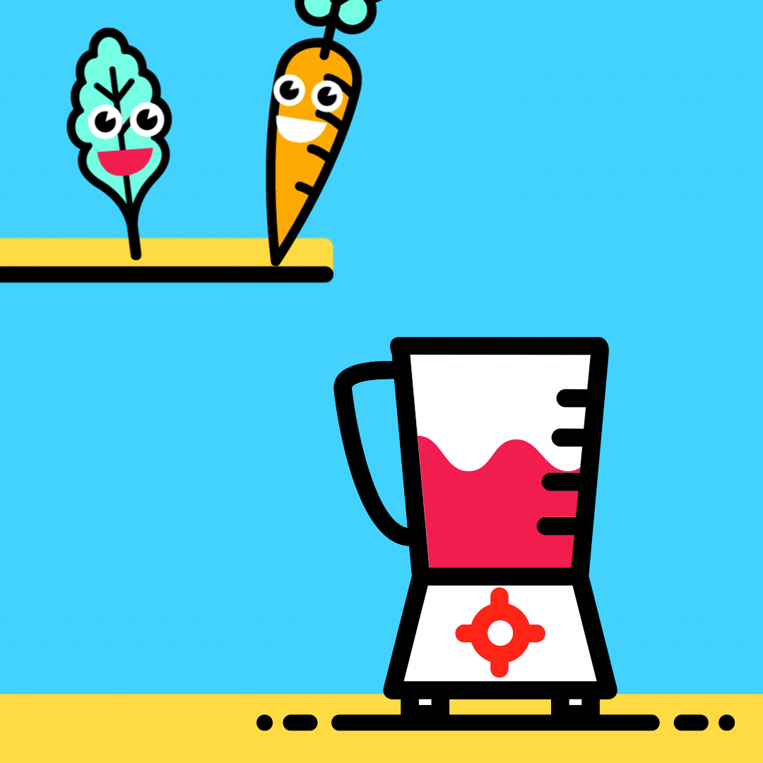
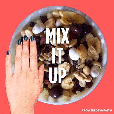
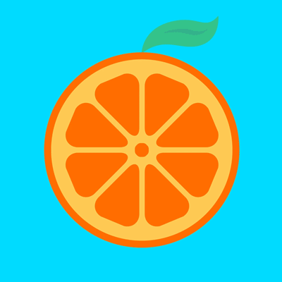
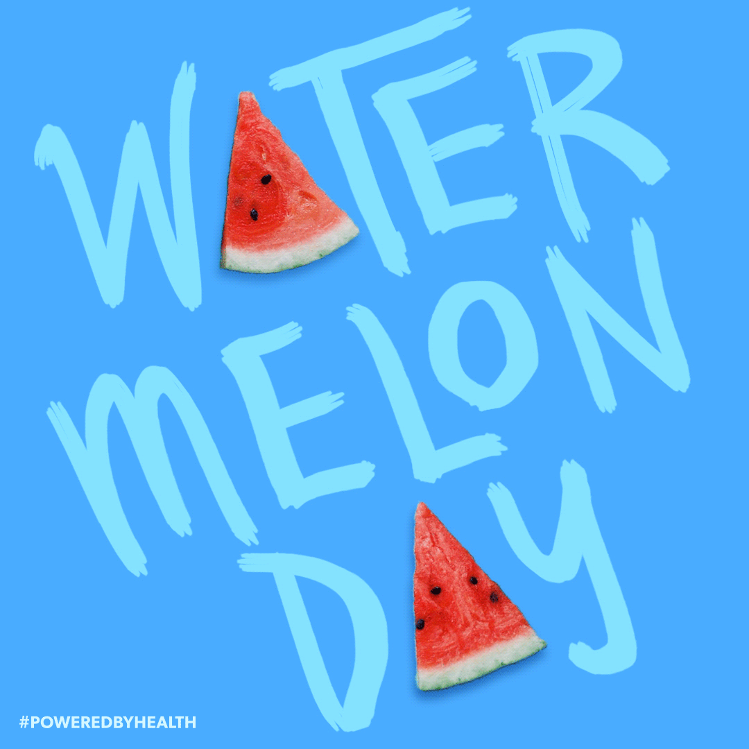
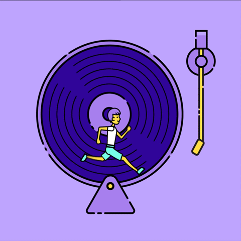
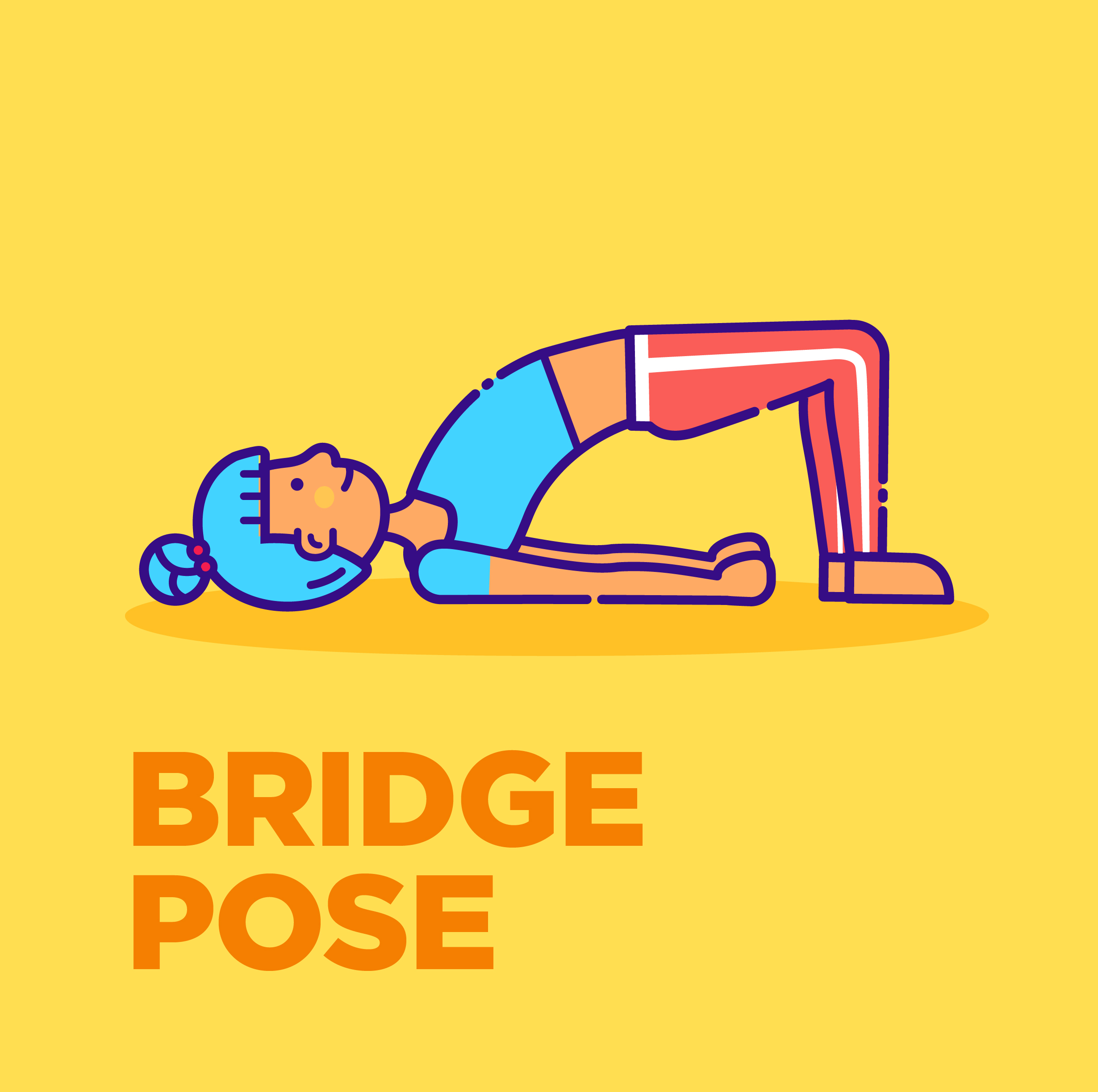
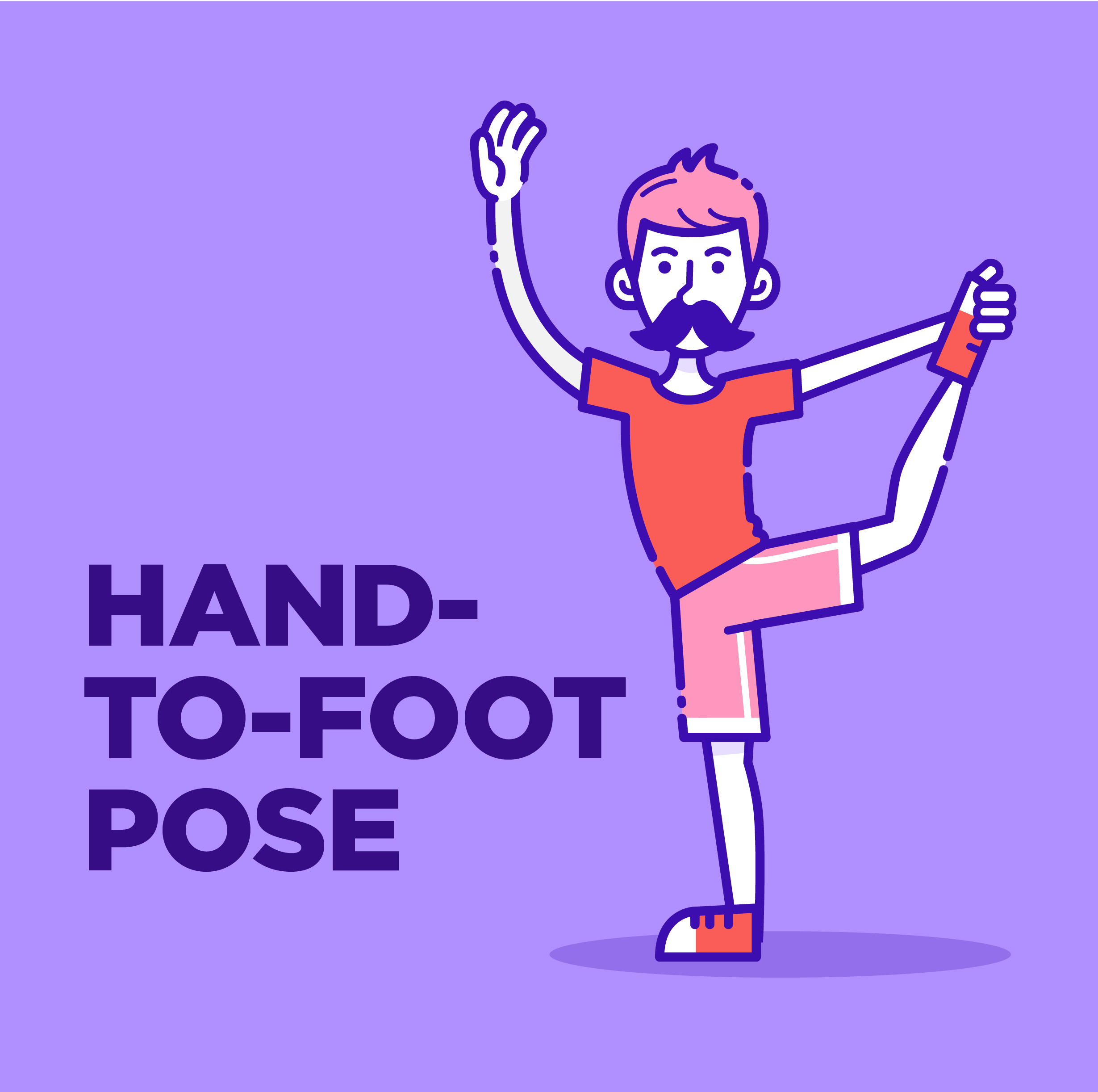
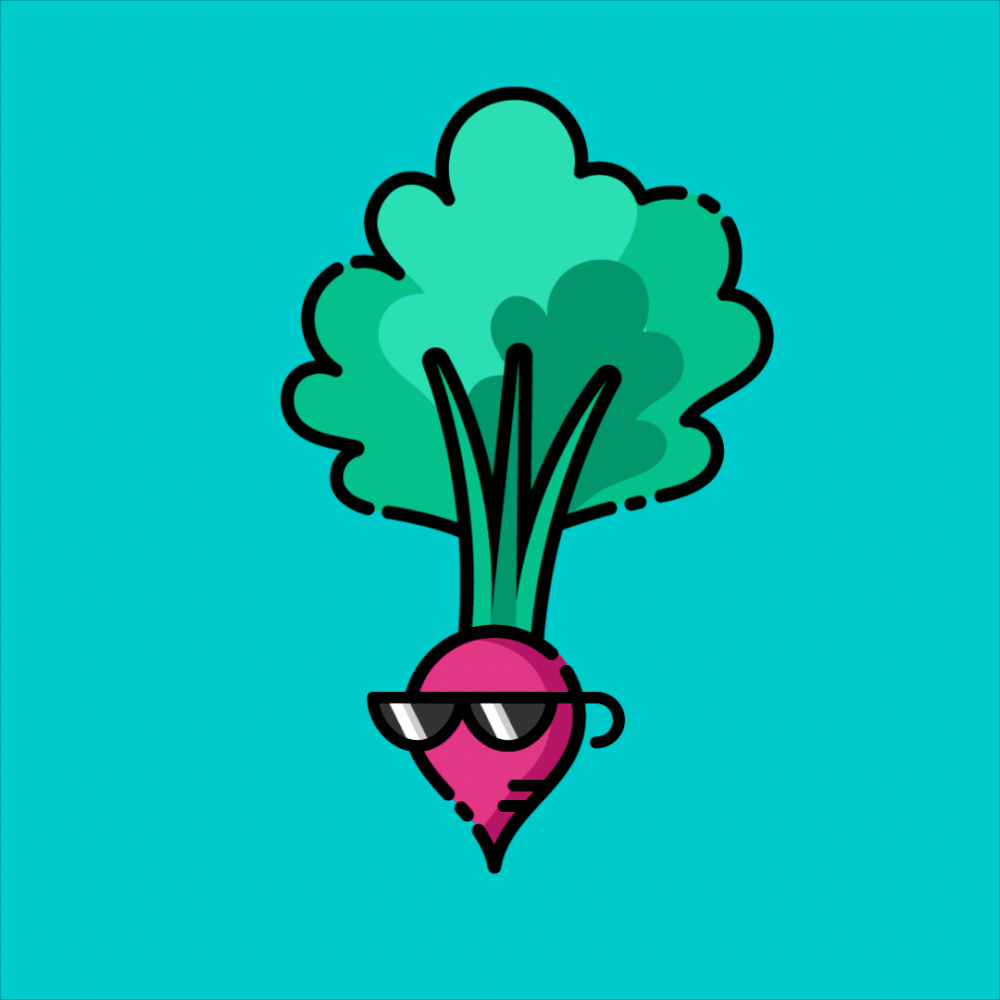
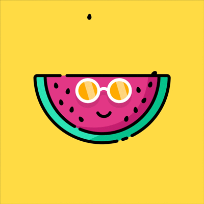
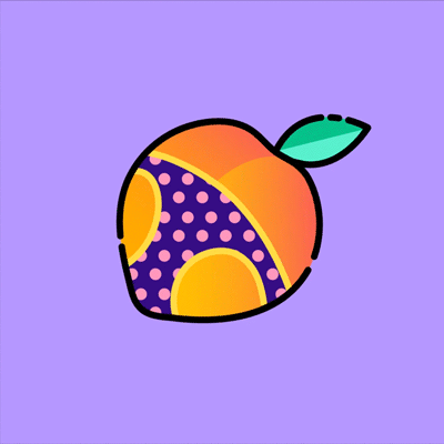
We implement two styles of illustration to address KP's informative yet lighthearted and personable persona. The first style is vibrant, simple, and iconographic, which are ideal for infographics, instructions, and representative symbols of everyday concepts (i.e. a good breakfast or sneaky ways to incorporate exercise).
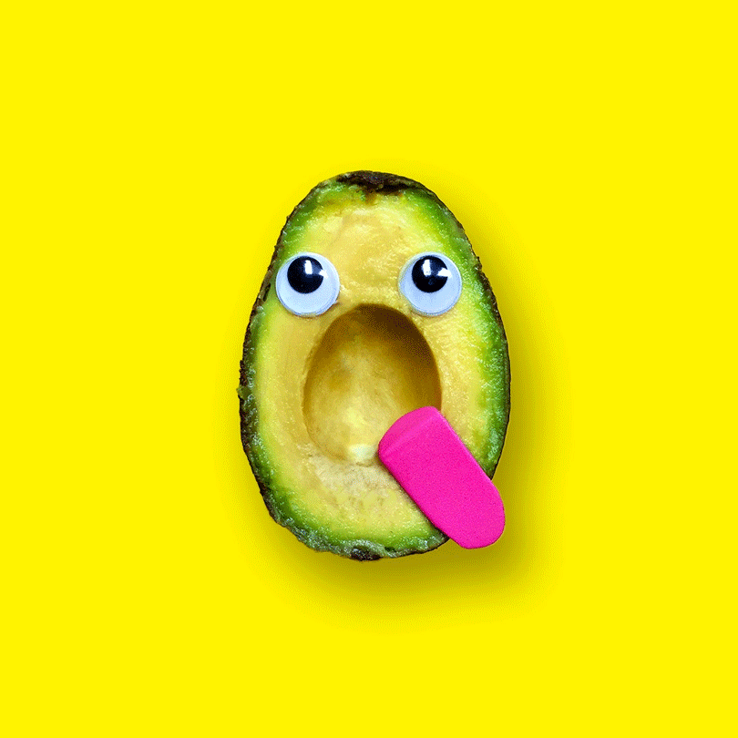
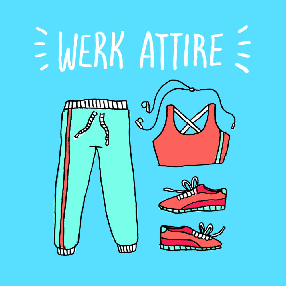
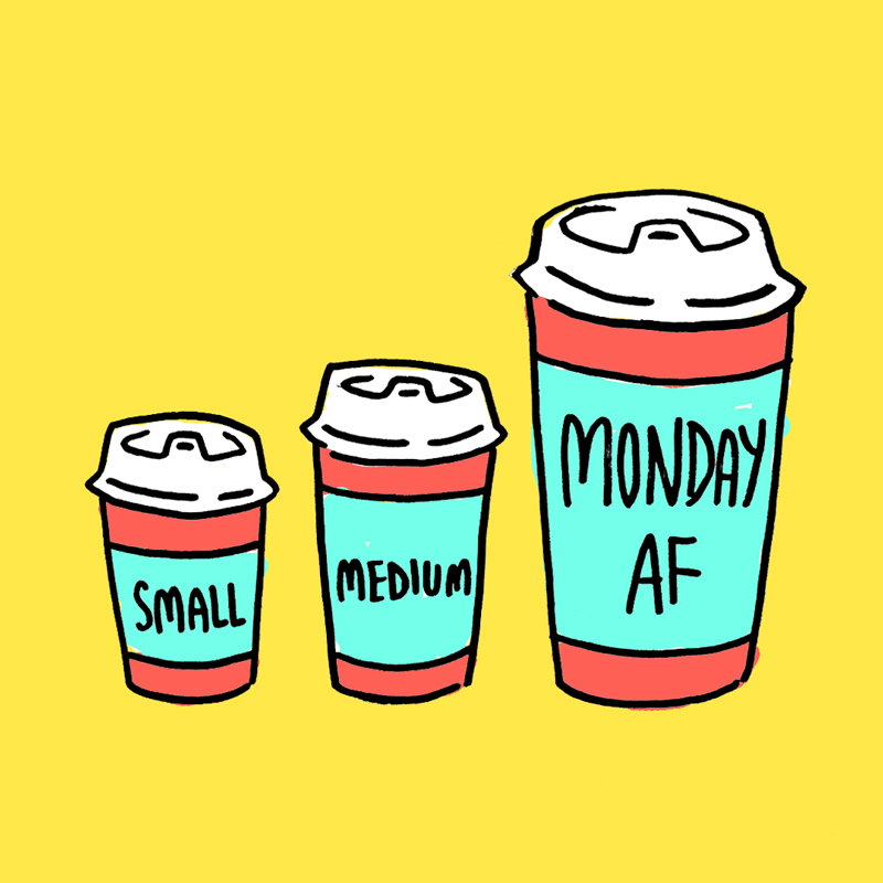
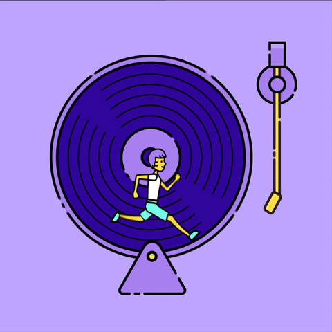
The second style is organic, effortless, and figurative. We use these for both fun, snarky messaging and more carefree concepts such as workout attire or drinking your morning coffee. The mixture of both styles create a harmonious contrast while keeping the social feed dynamic.


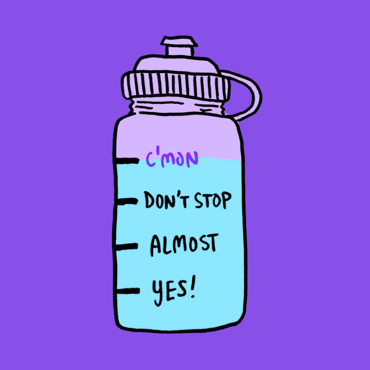
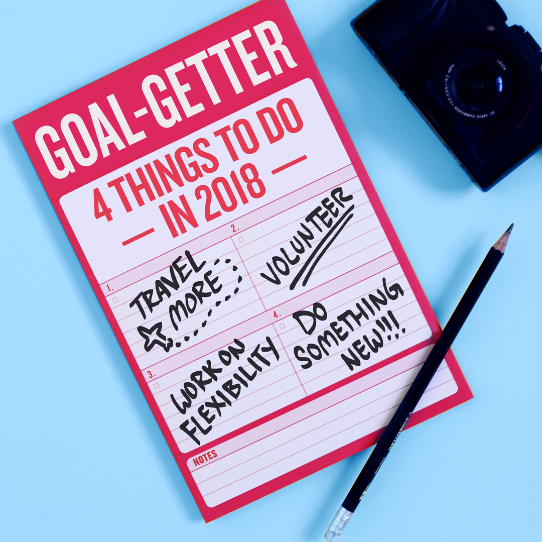
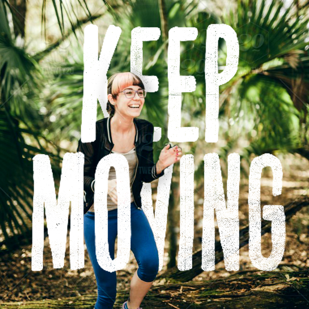
Knowledge with a Hint of Sass
We use hand-done typography and illustrative photography to add an extra kick to KP's new brand voice. These playful, eye-catching treatments would be used on call-outs, title cards, and announcements for special events or holidays. This furthers diversity and interest within the social presence. Together, all the elements together emulate KP's muse, Zoe, your upbeat, health-conscious friend trying to better her (and your) mental and physical well-being.
Design Director: Adam Vohlidka
Agency: Translation LLC.