NFL Youth
SOCIAL BRANDING
DESIGN DIRECTION
The Blitz
In 2017, the NFL introduced a campaign promoting youth football. As the NFL targets a new generation of football lovers, they needed a typeface that would both capture the essence of the sport and draw in a younger audience. We explored visual elements of the sport and paired it with a dynamic, youthful identity that mimics the excitement and versatility of the game. Three typographic options were presented. The result: one typeface, Game Point, was selected as the typeface, and the second, The Handoff, was chosen as the logo heading the NFL Youth campaign.
We designed the phrase, “The Handoff,” in each typographic direction by hand. Once the Game Point direction was chosen, Lauren Lee a Sr. Designer on my team designed the remaining 110 characters that included one regular alphabet, two stylized versions, and a palette of glyphs. The Handoff was a collaborative effort between me and my designers to create custom letterforms that reflected the sport's fast-paced environment. We then created guidelines and samples of how the typeface and logo was used, both as standalone pieces and together.

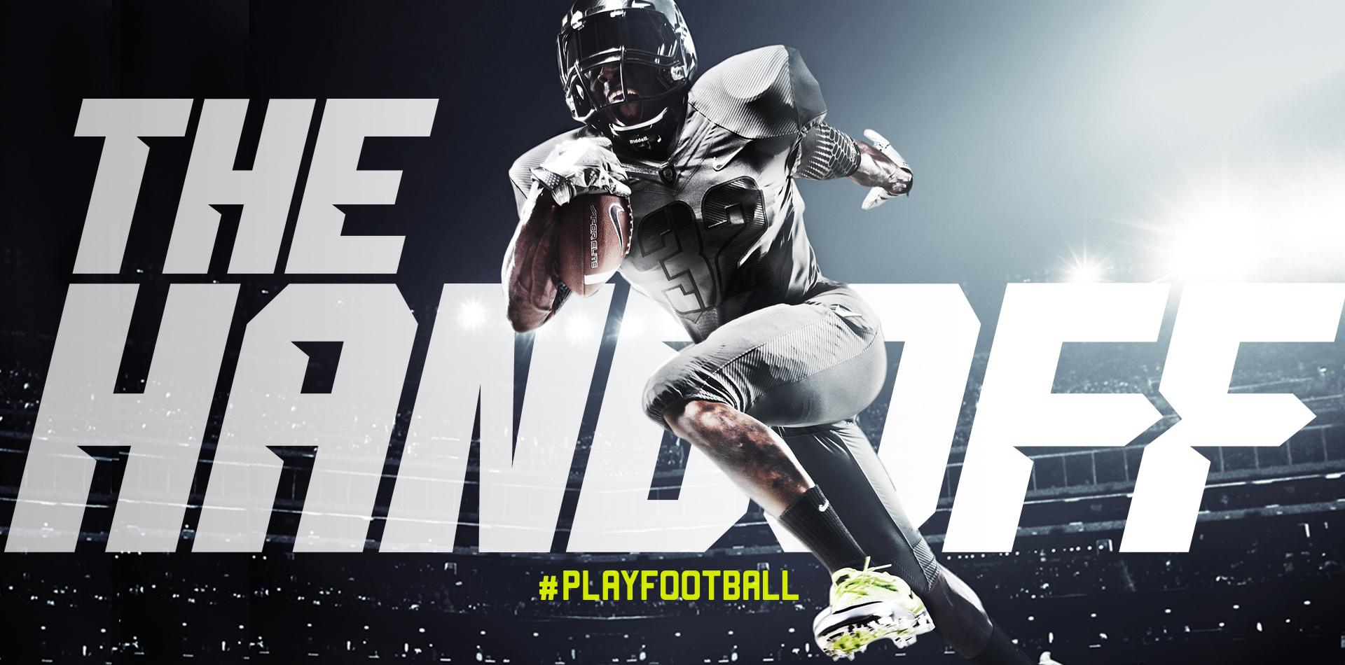
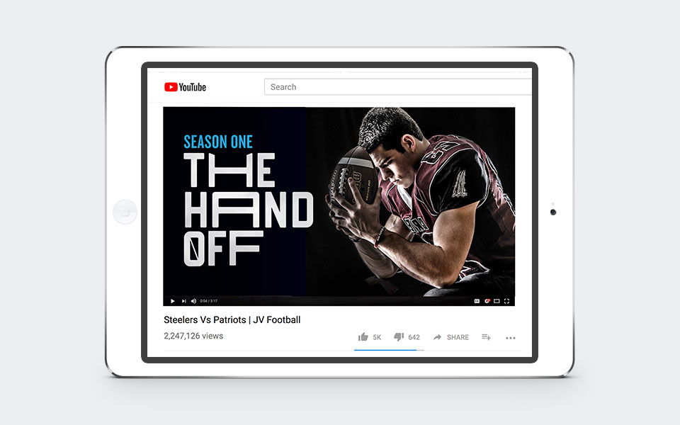
The Logo
The Handoff logo is comprised of hand-drawn letterforms inspired by the perception of football as a gallant battle. The style emulates a gladiator feeling with its sharp invasive and outfacing edges and kinetic movement. The logo is accessible through the Game Point font in the glyphs palette.


The Typeface
Game Point is a hand-drawn typeface inspired by three renown symbols of football: the jersey, the scoreboard, and the goalpost. Its overall shape reflects the mathematical strategy and design of the sport.The extended glyph palette demonstrates kinetic movement and stretching boundaries. Combined, the typeface captures the NFL's intensity and breaks convention, all while adding the right amount of flare. Diagram here shows the method to our madness (and measurement consistency).

Color
We chose a bright, vibrant color palette that appeals to a younger audience, making sure not to lean too feminine or masculine.

#PlayFootball
We supplied samples of how the font and logo could be used for digital, print, and social. The typeface emulates not only the movement of the game, but the versatility of its players. It can be used to elevate photography and video or showcased as a star graphic. It has been featured across all platforms of the NFL Youth campaign, from social assets to Super Bowl commercials.
Design Director: Adam Vohlidka
Agency: Translation LLC.